

maven living - deer lamp packaging

overview
A modern packaging system for Maven Living's
statement piece: the Deer Lamp.
The objective was to craft a packaging experience that reflects the
brand's design ethos—clean, functional, rooted in aesthetics—
while accommodating physical product constraints like the rattan
frame, exposed bulb, and unique shape.
deliverables
Final dieline and print-ready artwork
Multiple design concept explorations
Structural dieline with window cut-outs
Mockups for e-commerce and presentation use
design objective
Create a packaging identity that is:
Visually bold yet minimal
E-commerce and shelf friendly
Story-led and functionally secure
Inspired by lifestyle and nature cues

design explorations


final design
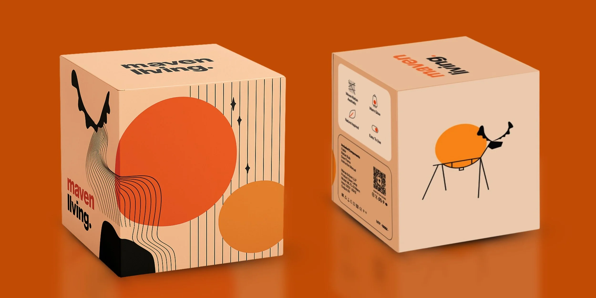
The chosen direction blended bold visual storytelling with structural elegance:
Peach-toned base with black & orange illustrations
Linework deer silhouette interacting with circular elements
Brand logo sized and placed to optimize shelf visibility
Side panels with feature list and product specs
structural solution

Diecut window on the top to preview the bulb
Multi-panel box with flaps to safely cradle the lamp
Consistent 190mm sides x 260mm height for stackability
typography & color system

Fonts:
Modern grotesque with secondary monospace for tech-style detailing
Colors:
#ff5722 (accent), deep charcoal, kraft beige, soft white, pine green


outcome
This project elevated Maven Living’s brand image into a premium
lifestyle space while ensuring packaging aligned with logistics,
e-commerce, and user delight.
client feedback
“Loved how every direction felt like a real brand
evolution path. We couldn’t decide between three options.
Packaging now feels as premium as the lamp itself.”
— Manas, Founder