

graamam foods — packaging & brand system
project overview
Graamam is a social impact food brand rooted in rural self-reliance. Our goal: capture the warmth of handmade, woman-powered nutrition in a modern retail context. This packaging was built to bridge rustic identity and urban aesthetics.
brand story
“Graamam isn’t a brand. It’s a quiet movement. Your purchase empowers resilient communities and celebrates food as a love language.”

design direction
visual reference: earthy elegance with vibrant South Indian cues
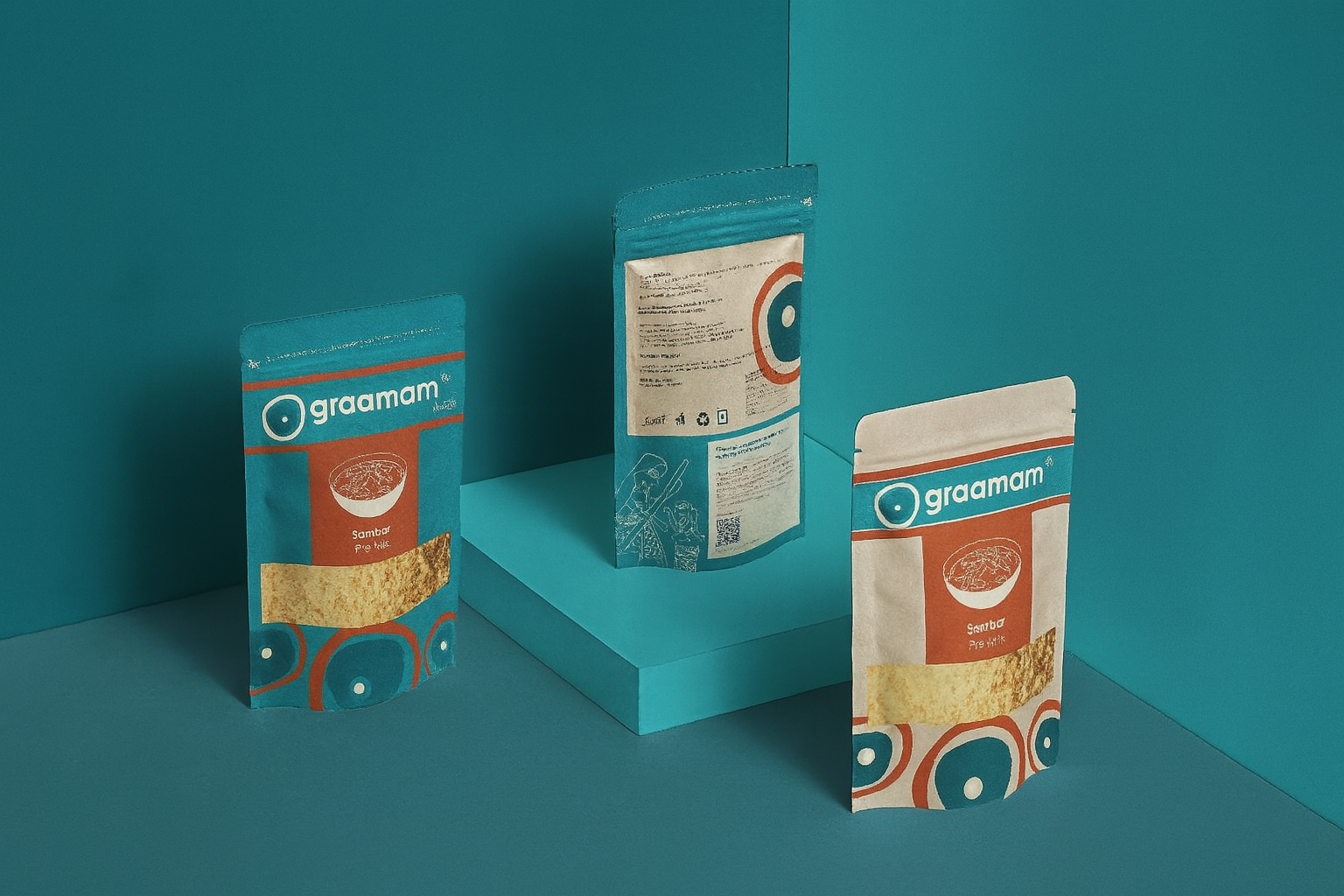
Color palette: Deep teal, terracotta, beige, muted mustard
Type: Geometric sans-serif with humanist warmth
Illustration: Hand-drawn icons inspired by folk rituals, adapted to vector form
design explorations


challenges faced
balancing authenticity with shelf appeal:
One of our core challenges was preserving the rustic, rural essence of Graamam without appearing dated or overly traditional. We had to ensure the design resonated with modern, urban consumers while staying true to the brand's grassroots identity.
communicating social impact without cliché:
Graamam's story is powerful—but it was important to avoid typical “NGO-style” design tropes. We chose subtle, emotionally resonant storytelling through visuals and copy rather than overt messaging.
material limitations for rural production:
The brand's commitment to local manufacturing meant certain packaging formats and print techniques weren’t feasible. We had to find aesthetic solutions that worked within constraints like limited foil, print registration shifts, and eco-pack material.
creating a standout presence on crowded shelves:
Retail environments are cluttered. Designing a pack that feels handmade yet structured enough to command attention among mass-market brands required multiple iterations of layout, color contrast, and visual rhythm.
maintaining consistency across variants:
With future SKUs in mind, the system needed to flex across a growing range of millet and spice products while retaining brand cohesion. Establishing a modular but memorable system was essential.
final design


Each front pouch layout includes: - Logo band with variant colors - Hero food icon (bowl illustration) - Transparent window for real content visibility - Footer ring with folk circle graphics and empowerment message
Back-of-pack includes: - Ingredient list, MRP, shelf life - Nutrition claim area ("No oil. No preservatives. Pan roasted.") - Brand manifesto with Proto Village credit - Folk-style illustration of rural women at work
typography and color system

Fonts:
primary font - frutiger and secondary font - lato
Colors:
#2C6164 (accent), #945331, #C1964C, #CDC2A1, #FBFAF6


final outcome
This packaging established Graamam Foods as a credible, desirable player in the urban
market while staying rooted in its mission. The visual system now extends to multiple
products across their millet and spice range.
client feedback
“This design honours our people and feels like a badge of trust on every shelf
— Kalyan, Founder